Continuum Consulting
A professional website design
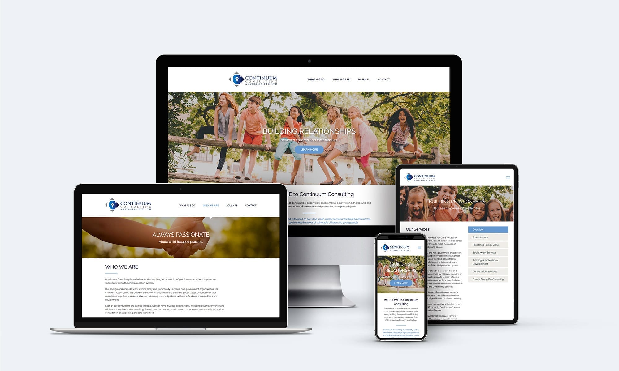
Danielle is a passionate advocate for the continuum of care of children who have experienced trauma. She first came to me looking for a brochure design, but after our first meeting, I could see that the website they currently had did not reflect her passion. My challenge was to create a website that communicates the care she and her colleagues have for what they do, whilst being easy to use and engaging for the end user.
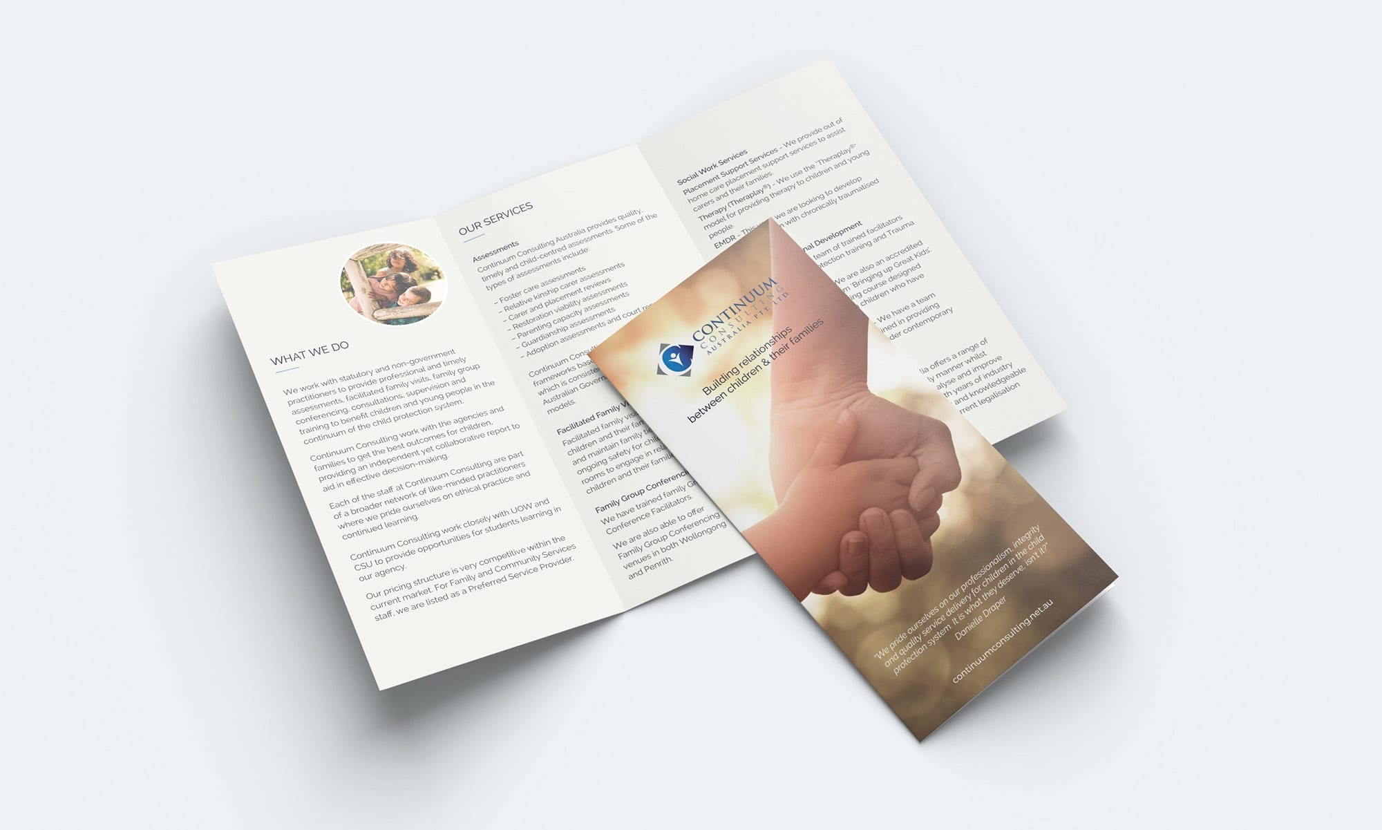
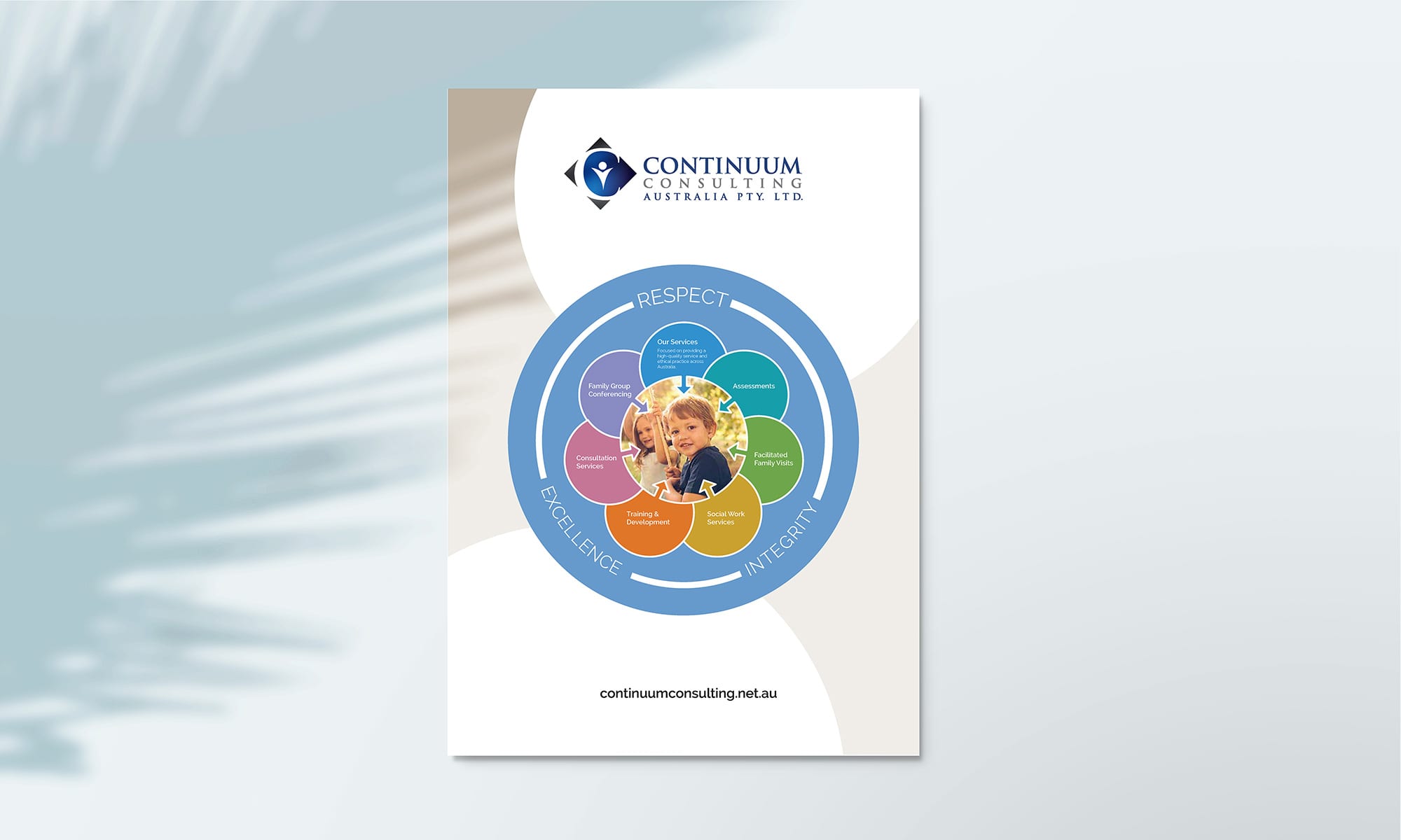
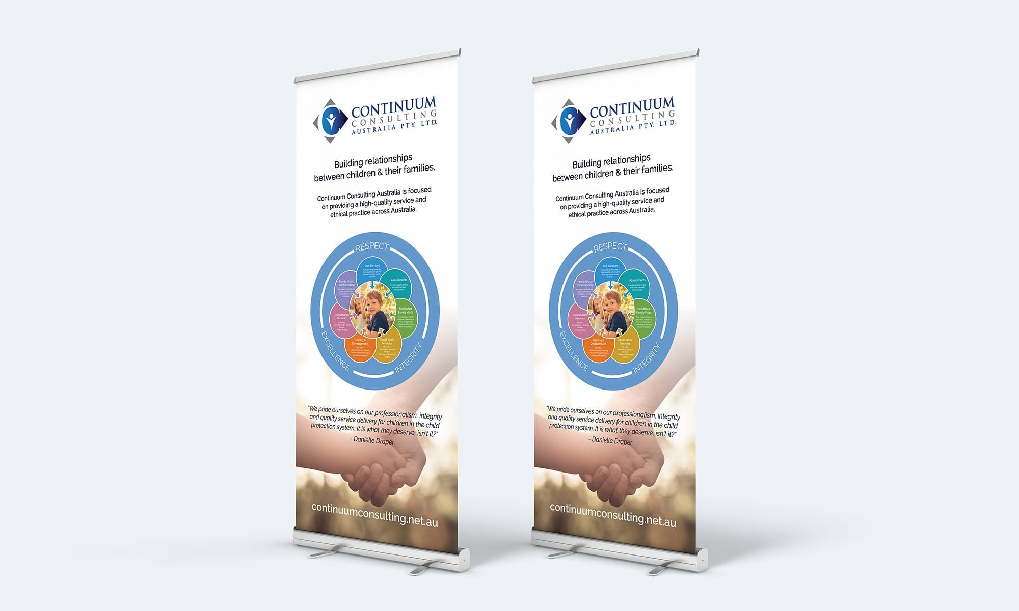
The new brochure was designed based on the look and feel of the website. In addition to the other items, we have created a consistent look and feel across all branded collateral.


The Result
The Continuum Consulting website was built using WordPress, with an emphasis easy to find services.
Their branding and graphics were integrated throughout the website, resulting in a user-friendly experience, consistent imagery and the calmness of Danielle’s favourite colour, blue.

