Billy Baxters
A Homewares store brand identity design
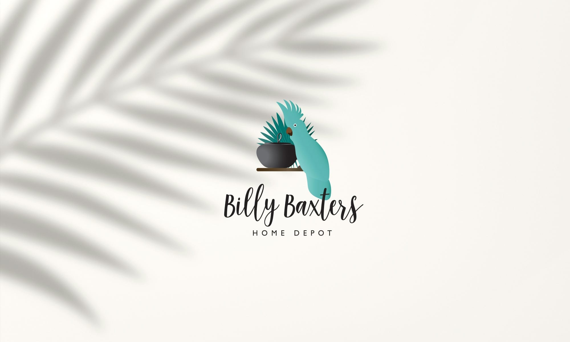
Billy Baxters Home Depot is the brainchild of one man who has years of experience as a buyer for wholesale retail. Wanting to fulfil his dream of owning his own shop, he opened one store and now has multiple stores.
The logo and branding was about realising and working with an idea he had had for many years. The parrot was created from a sculpture he owned and the pot was always a favourite of his. My job was to create a logo that reflected a 'Hamptons beach style' whilst still keeping his vision intact.
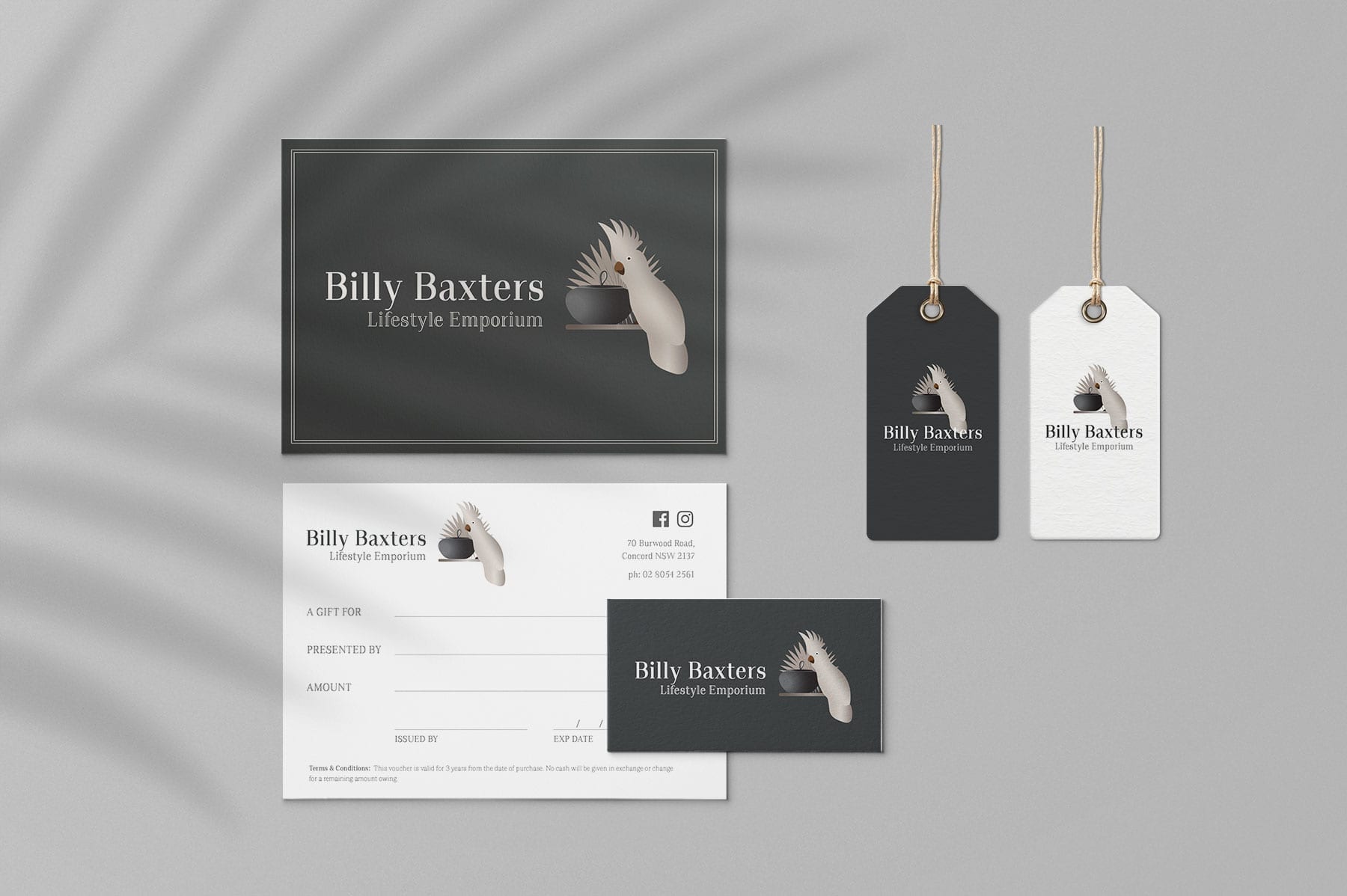
Early in 2019 he expanded the brand to Billy Baxters Lifestyle Emporium, that referenced a more 'French provincial' theme. So working with the existing logo the colours were changed to reflect the look, feel and style of the new store. The fonts for the name were also changed to be more sophisticated and luxurious.


The Result
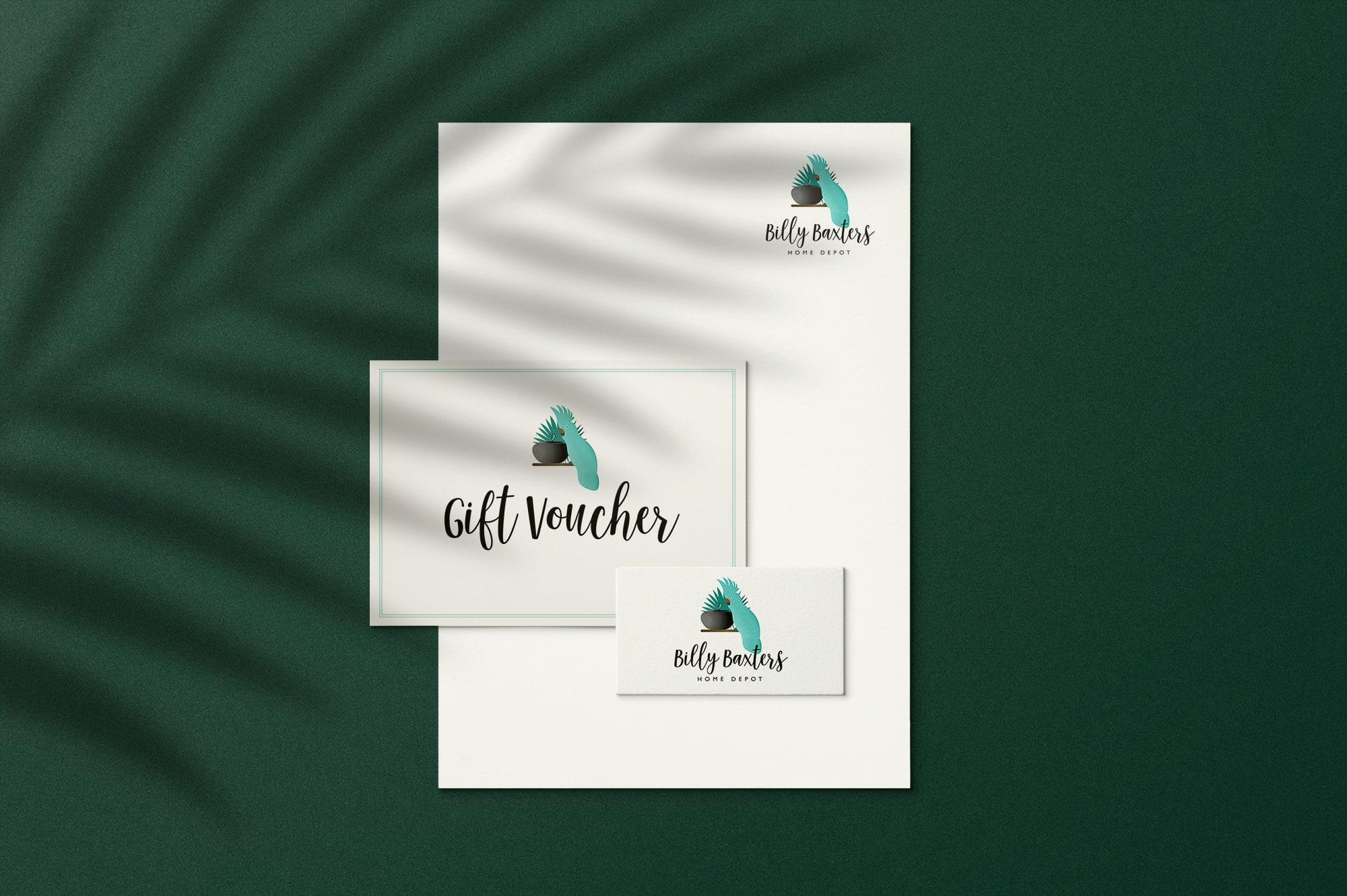
The Billy Baxter’s Home Depot logo, branding and graphic design elements, which includes printed collateral was achieved by listening to the client and making his vision a reality.
The brand identity reflects what Craig always wanted his brand to be and it is still going today.
The designs feature:
SERVICES
- Brand Identity
- Graphic Design


