9 Key ingredients for a Sales Page that really sells
Date Posted:
November 22, 2023
Categories:
Sales Page Synergy
Why your sales page needs drop-dead design & cracking copy
Whether you’re selling services, a course, membership or even a product like a subscription box, an effective sales page can be the difference between crickets or ka-ching when you launch. But like many things, the best sales pages involve a partnership between design and copy.
In this blog, co-written by sales page copywriter Angela Pickett and web designer and developer Elise Doyle, we’re going to explain why investing in both copy and design is crucial to sales page success.
As I shared in my blog about I thought sales pages were only for entrepreneurs, coaches, course creators and big-ticket items like memberships. The word sales made me queasy, picturing sleazy, sneaky hard sells. Turns out I was wrong.
A good sales page is super valuable for the user because it includes:
- key details about the service
- who it’s for (and not for)
- proof – results, testimonials and case studies
- pricing and bonuses
- frequently asked questions
- a guarantee and details about the fine print
Does the design inform the copy or does the copy inform the design? The answer is neither.
Design and copy are two elements that work together to take your visitor on a journey from the top to the bottom of your sales page using the combined power of words and visuals.
1. Before You Start
You’ve got your course, membership, product or service worked out and ready to go, but do you have the backend infrastructure set up?
Before we even get to the fun part of writing and designing the page, you need to think about how your customers are going to find you?
When they find you, are they joining a ‘waitlist’ or can they buy straight away?
When they purchase, how are you taking their payment?
Yes, the end product is what you’ve put thought and time into, so it’s just right for your customer, member or client. But we need to make the pathway to your product, course or membership as seamless and stress-free as possible. So, make sure you have your customer’s journey mapped out from first sign-up to (almost) final purchase and ongoing. This is where your copywriter can make all the difference.
Sharing your sales page and then following up your offer, also requires copy.
To start, you need copy for your lead magnet (downloadable) to get people onto your email list and into your funnel. Then you need to work out what you’re going to say in those emails to encourage people to buy your offer. And once they’ve clicked on the ‘buy now’ button, you need to keep communicating with them.
Knowing how this flow of communication will work, and what you’re going to say, is a crucial first step in getting the sale and ensuring your customer is happy.
2. First Impressions Matter
Create an immediate first impression and grab your visitor’s attention with an eye-catching design. Your sales page should work with the design of the rest of your website. But it should also have some unique elements and layouts to get your customer engaged.
But first impressions need more than just visuals. Compelling copy is crucial to engage with website visitors, starting with a persuasive headline that shows you understand the problem. Those opening sentences explaining why you’re the person with the solution your customer needs.
3. Visual Storytelling
The effective use of elements like icons, shapes, colours and images convey your brand’s story and take your visitor through the page in a logical, persuasive and reassuring way. They need to feel that they are still on your website and connected with your business.
But even the most eye-catching visuals still need persuasive copy. Not only does it enhance the narrative, but it ensures the reader has no doubt what the visuals represent.
Once they’ve read the headline, the copy needs to show that you understand their pain points and that your product or service can solve it.
4. User Experience (UX) Enhancement
Create a seamless user experience using navigation with intuitive design. Your sales page must be easy to navigate, and your visitor needs to find the information they’re looking for quickly.
We do this with an on-page menu where your visitor can easily jump down the page to the section they want. It’s also achieved through the design. When your visitor is reading the copy on the page, they will also make visual connections, so the information needs to be broken up into digestible and identifiable chunks.
Sales pages are more than just the right words. One of the biggest mistakes on sales pages is too much text that not’s laid out logically.
On a long page, multiple calls to action are important. Keep this copy super clear and consistent and save your quirky copy for the other sections.
Your call-to-action (CTA) should finish the sentence “I want to” and be the same throughout the page. Book Now and Buy Now are good options. You can read more on CTAs below.
5. Building Trust and Credibility
Using your logo, brand colours, typography and elements will instil trust and reinforce your brand’s identity. We can also use elements like certifications and awards you’ve received that are relevant to what you’re selling. This all adds to building trust and credibility.
The copy needs to highlight the benefits and value, but obviously not make untrue claims. The style and tone of the language needs to be consistent. This can sometimes be a problem where sales pages have grown with the business, being added to by different people.
Including testimonials and social proof is another way you can build trust and credibility. Asking for a testimonial should be part of your process.
6. Emotional Appeal
Using authentic imagery, like photos of you, your team or products in the design, evokes an emotional response and resonates with the audience. We can tap into other emotional areas like urgency and FOMO (fear of missing out) by the use of countdown timers, special offers and limited places.
The goal of your sales page is to elicit a reaction. Ideally, if you’ve got your ideal customer, they will click the buy or book now button. Or if they aren’t the right person for your product or service, you want them to click away off the page.
Getting that reaction involves emotion. Using words to remind the reader just how uncomfortable or unhappy the pain point makes them feel. If your service is only available for a limited time or you only have a few spots available, you need to use language to convey that. The right emotional language will also help drive those FOMO.
7. Search Engine Optimisation
We want your sales page to load quickly as this helps with user experience.
You need to:
• optimise your images and videos
• use a caching plugin (if you have a WordPress website)
• use the correct H tags and minimise code
While we always want to write for our clients and customers – that is, humans first, we also need to consider search engine optimisation. Using keyword research tools, identify a suitable keyword and synonyms to help get you found online. Optimise your copy, name your images correctly, add title tags and add your meta description to give your page the best chance of being ranked by Google.
Need some tips on SEO? I recommend Kate Toon’s free SEO Nibbles course.
8. Mobile Responsiveness
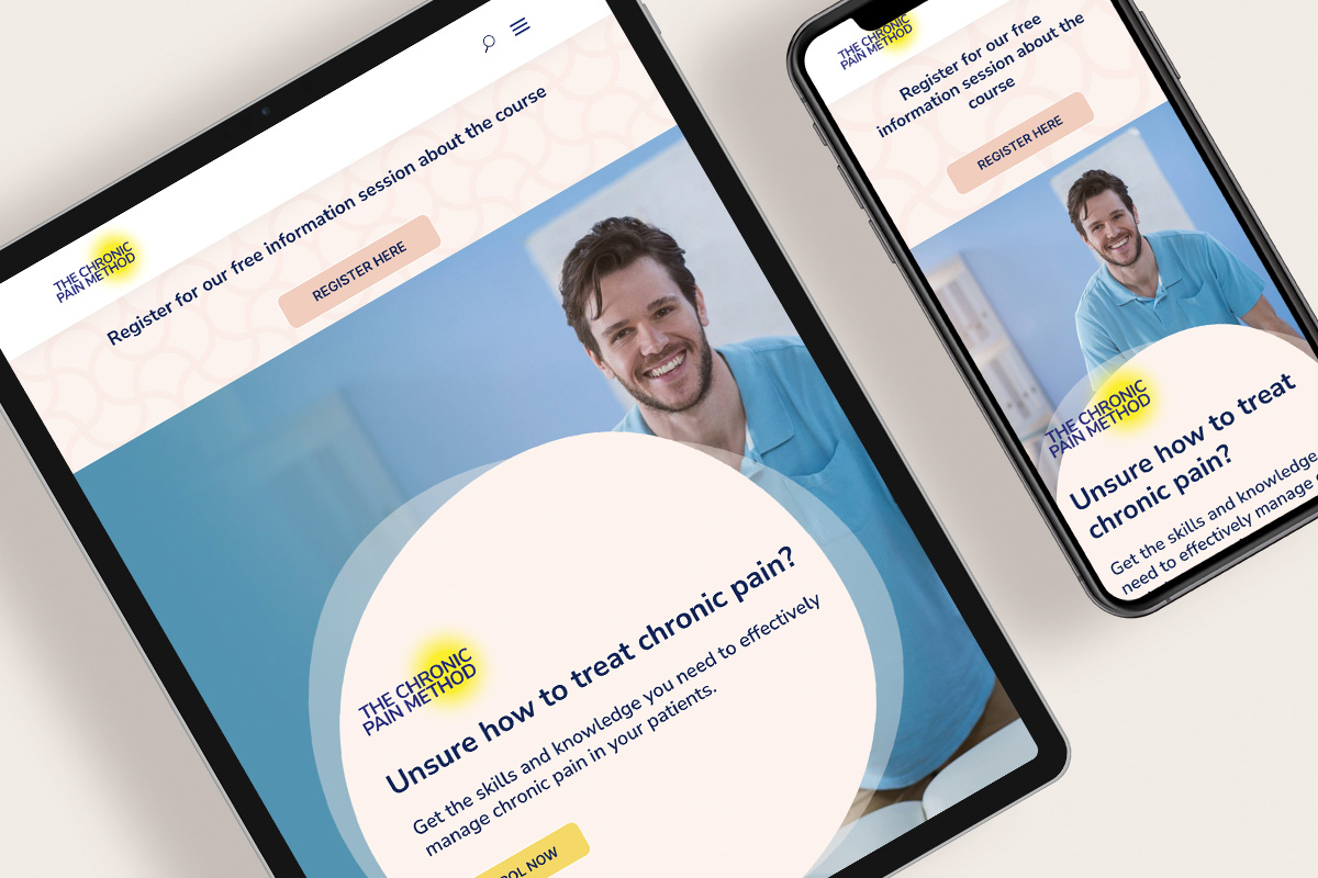
As much as I love to design sales pages for desktop sites, the reality is, a large proportion of visitors to your page are using a mobile device. It’s imperative that the user’s experience on a mobile device is as seamless and engaging as the desktop version. A mobile responsive page design helps with your search engine results as well.
And because more people are reading on a phone, we need to ditch the rambling long sentences.
To ensure your copy has impact and is easy to read on a mobile, you should use:
• headings and sub-headings
• bullet points
• sentences under 20 words
• a mix of sentence lengths
• contract words
9. Call to Action (CTA) Effectiveness
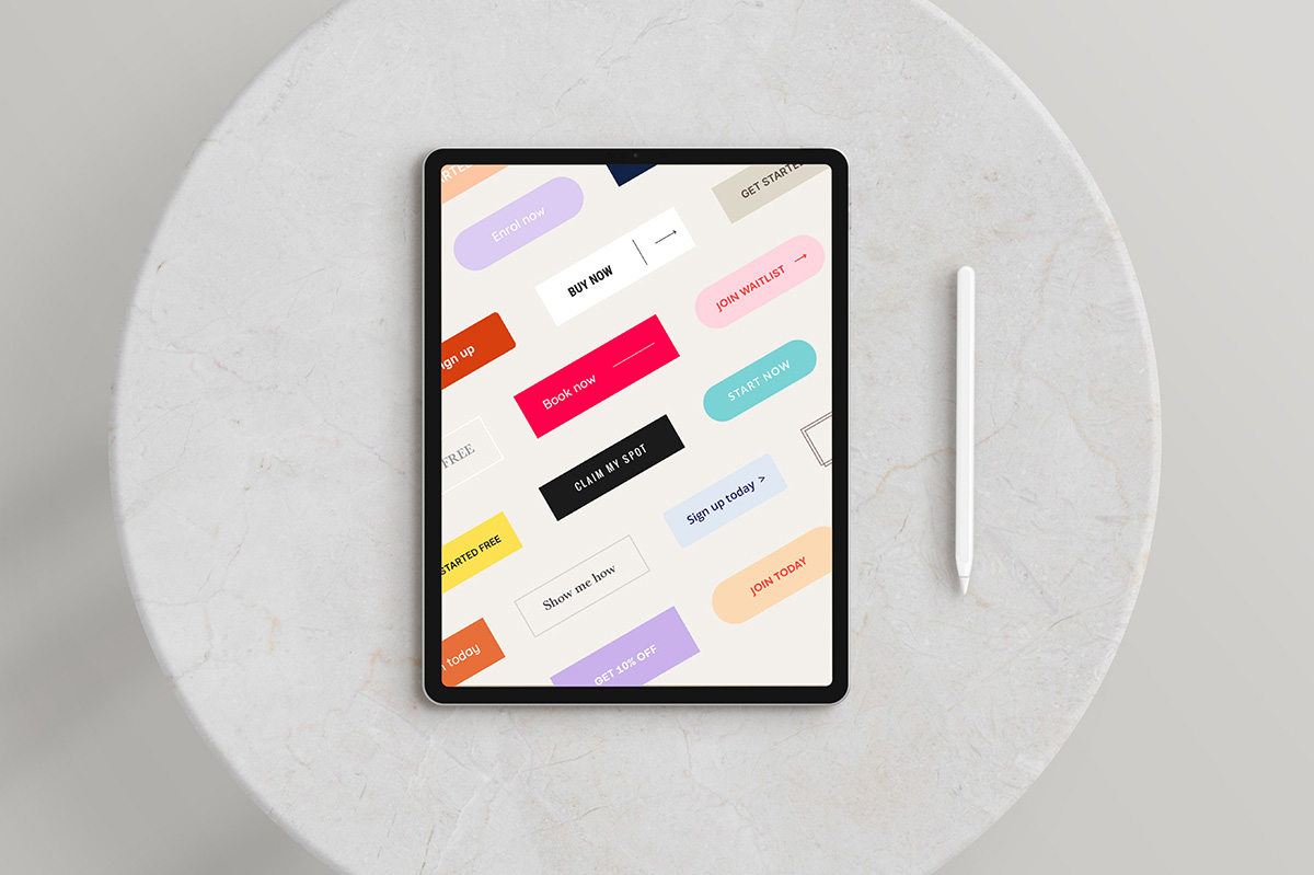
Your CTA is the one consistent element on the page that must be the same as your visitor travels down the page.
The colour you use for your CTA button should stand out and be one you haven’t used much in other parts of the page design. This helps the visitor easily recognise where they have to click to buy, sign up, etc.
When the user clicks your CTA button, it should jump down to the section where your pricing or sign up form is so you can make the sale.
An effective sales page will have a consistent call-to-action after each main block of information. Use strong action words and make it clear what you want them to do.
The CTA button text should finish the sentence – I want to. And adding now is great if there is a deadline or limited spots.
Some common (and effective) CTAs for sales pages include:
• Book now
• Sign-up now
• Buy now
• Join now/Join today
• Start now
• Claim my spot
Like menus, CTA buttons don’t need to be quirky. Making it easy for the person reading to click and say yes to your offer should always be the key.
Conclusion
So, as you can see, having a successful sales page that sells needs an equal focus on both the design and the copy. And while investing in both might seem expensive, when you consider the potential return on investment, it’s definitely worth it.
You can visit our websites to learn more about our sales page copywriting and design packages.
A Super Special Offer
As a special offer, we (that’s Elise Doyle Design and Angela Pickett Copywriter) are offering 4 discounted sales page design and copy packages.
We have 2 available to start in December and 2 in January 2024.
The cost is $3797 (inc. GST), with the first instalment (50%) due by Friday 1 December 2023 to confirm your spot. This represents a huge discount on our individual base packages.
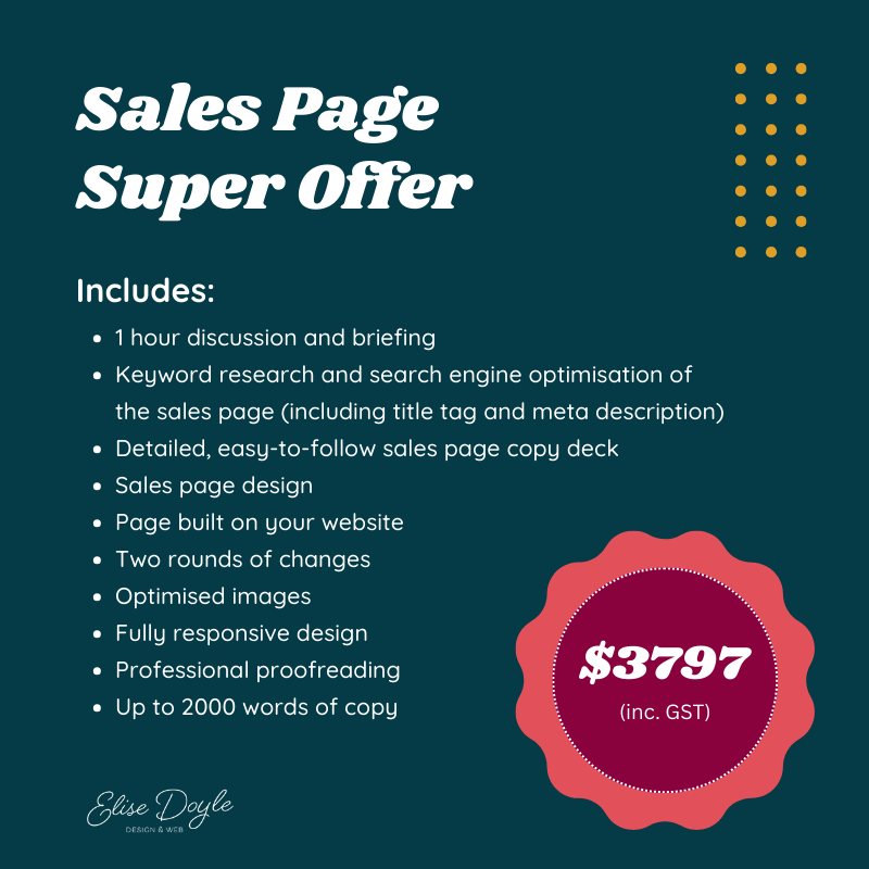
If you’re keen to grab one of these packages, email Angela or Elise and we’ll be in touch.
Elise Doyle is an experienced, approachable web designer and developer, who uses creativity, knowledge and SEO know how to create websites that are engaging, technically sound, and convert your visitors into your customers.
Angela Pickett is an experienced website and sales page copywriter who has worked with small and large business, non-profits and government. Using her stellar communication and organisational skills she transforms ideas into logical arguments to create high-quality, straight-talking sales page and website content.

